In the red
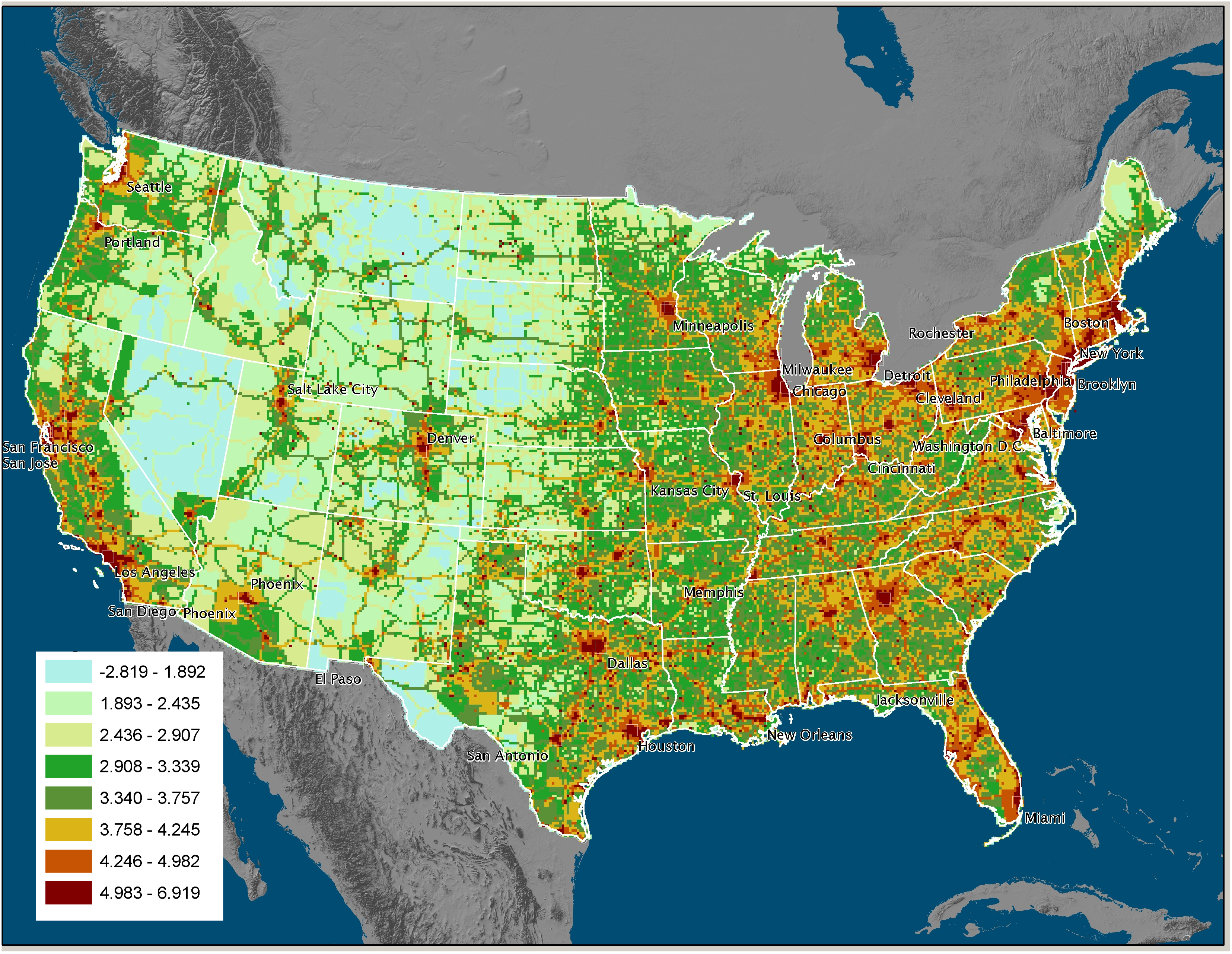
Apr. 15th, 2008 12:29 pmThey put out a new map of CO2 emission in the US today.
http://news.uns.purdue.edu/images/+2008/gurneyvulcan1.jpg
I am very sad to see I live in a red zone.
http://news.uns.purdue.edu/images/+2008/gurneyvulcan1.jpg
I am very sad to see I live in a red zone.
no subject
Date: 2008-04-15 05:05 pm (UTC)no subject
Date: 2008-04-15 05:20 pm (UTC)This is the tightest resolution of the data to date.
So it gets into much more detail then before. You've already noticed a pattern (highways) that some have tried to deny...
no subject
Date: 2008-04-15 09:07 pm (UTC)